What We've Made
B2B. B2C. CPG. Tech. Healthcare. Blockchain. Coworking. Coffee. Plumbing. (Yes, really). Don't fall anywhere on that list? Great — we love learning new things.
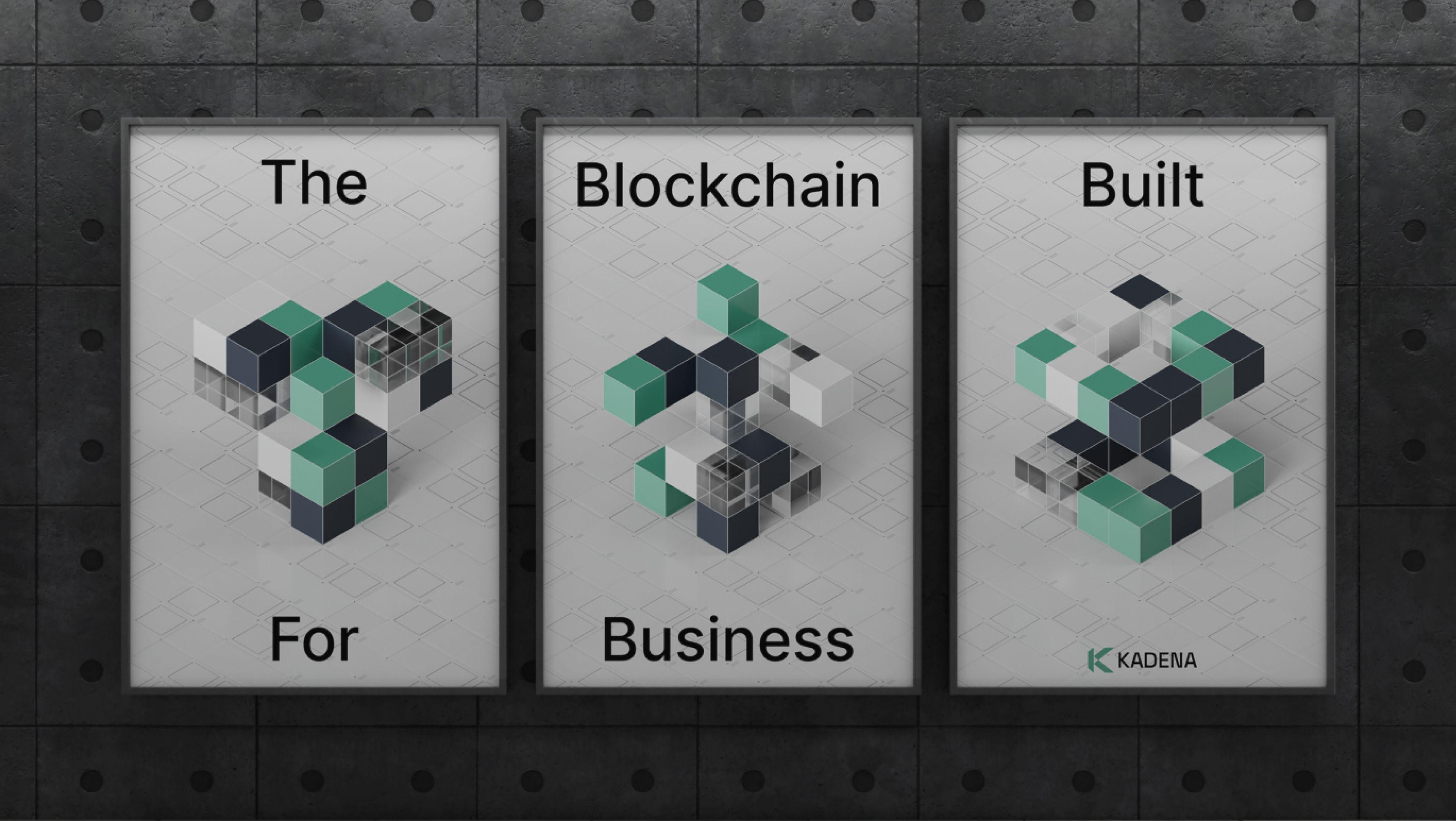
Kadena
We helped a revolutionary blockchain company stay relevant in the fast-moving world of web3 by reinventing it from B2C to B2B.
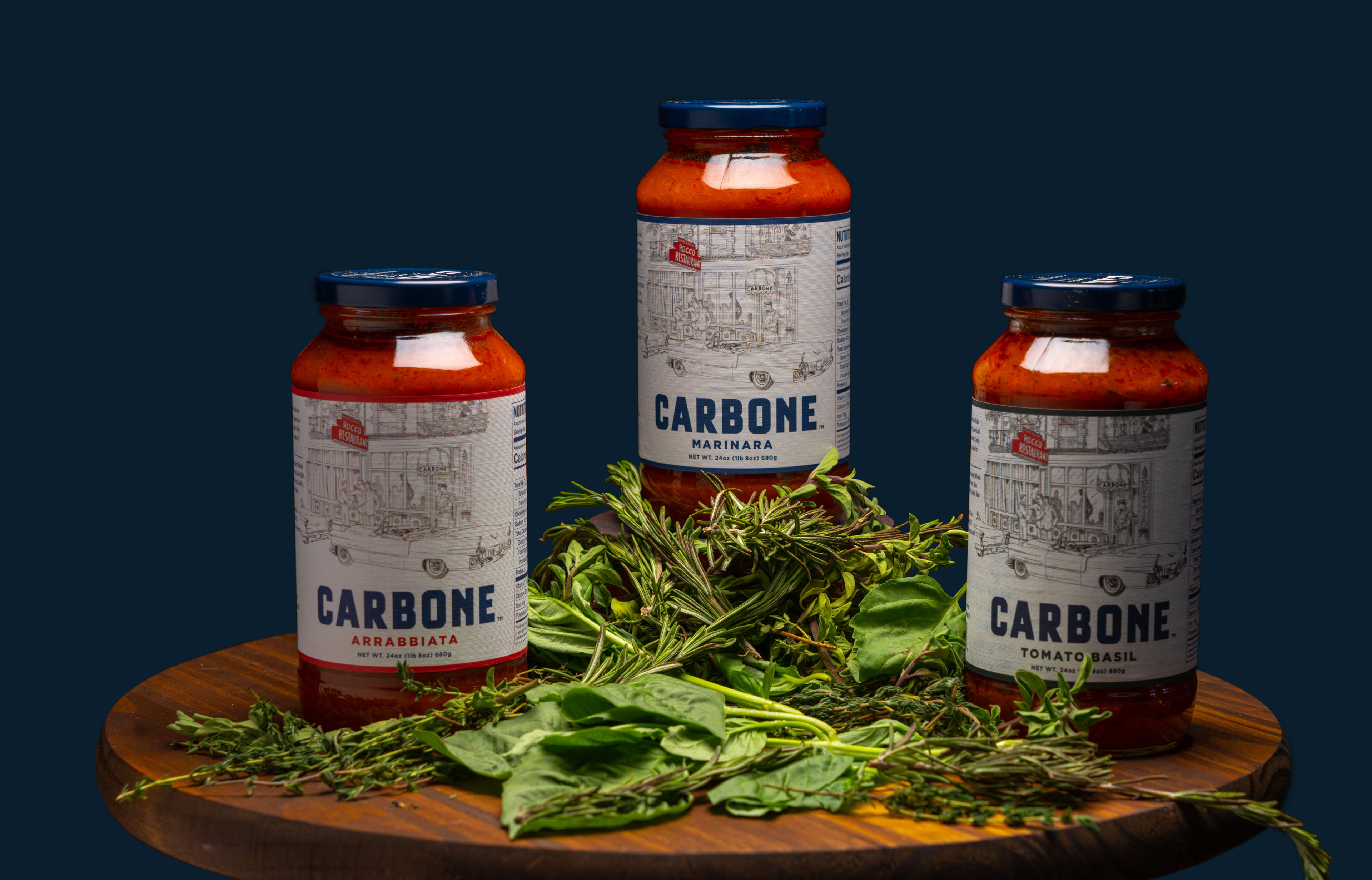
Carbone
We helped turn a CPG website into a stage the brand could own.
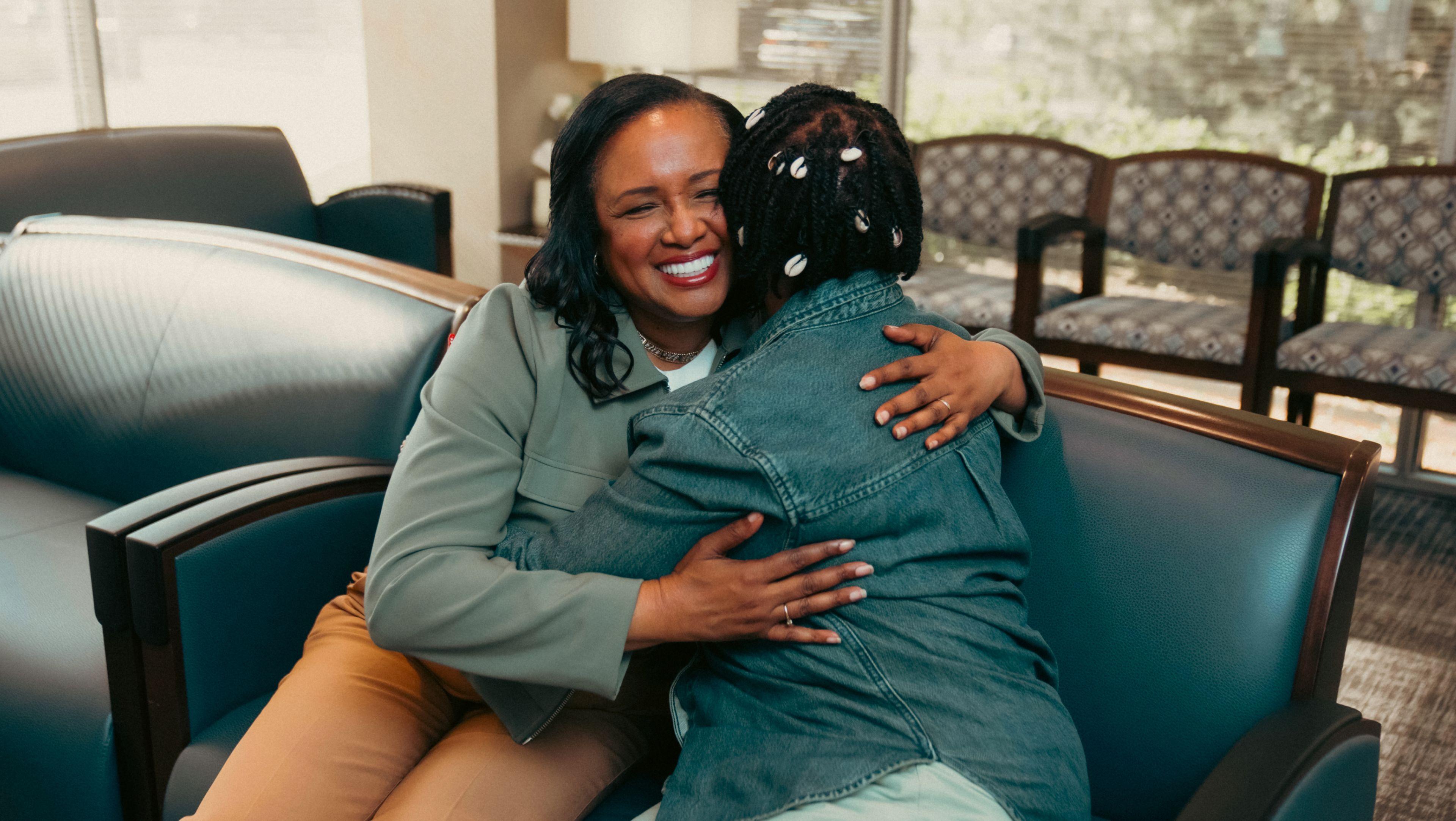
ClearChoice
We helped the leader in dental implants build smiles for life with a national broadcast campaign.
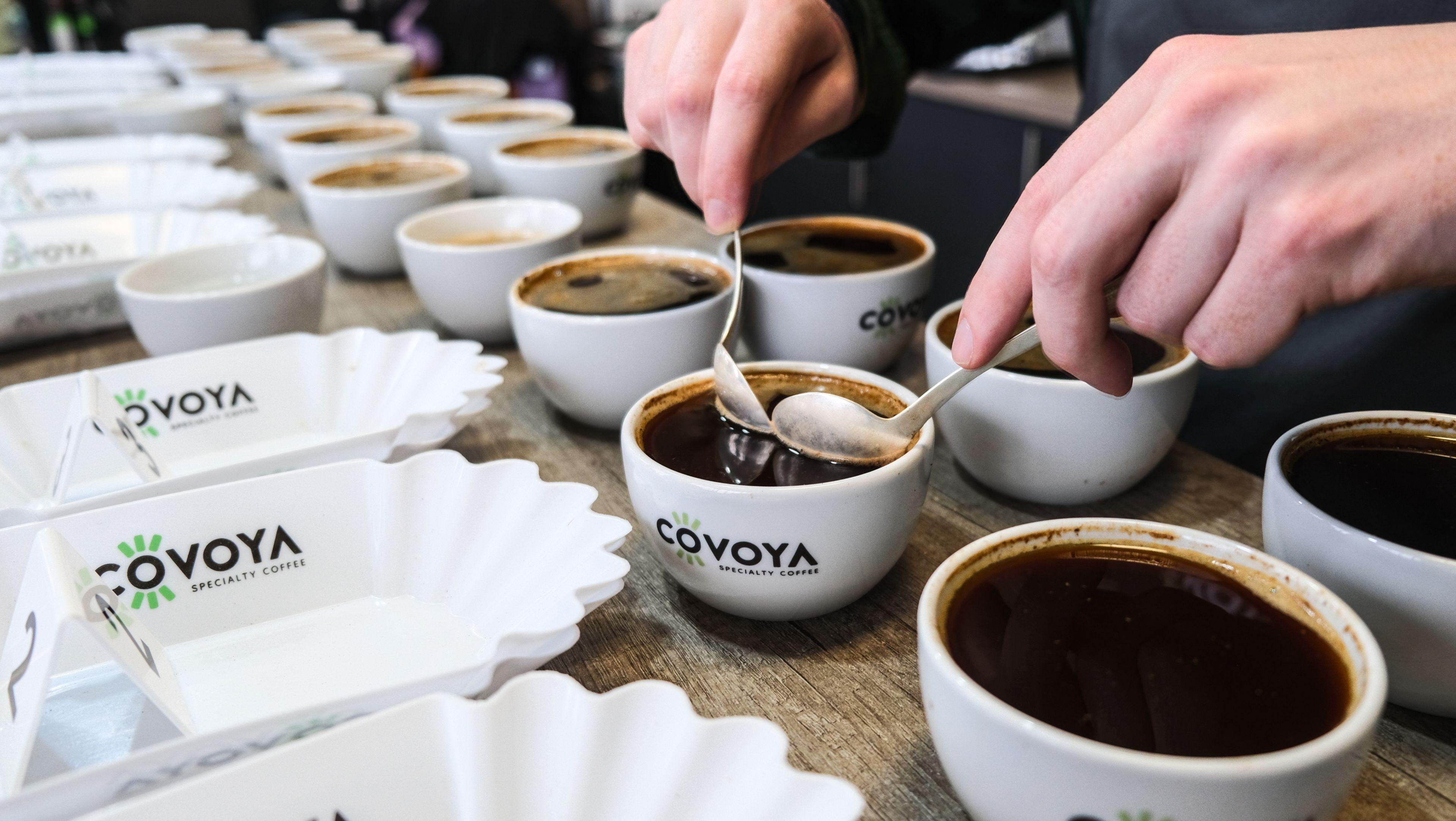
Covoya
We helped brew a new brand of specialty coffee wholesaler and support it through email, paid media and tons of sales materials.
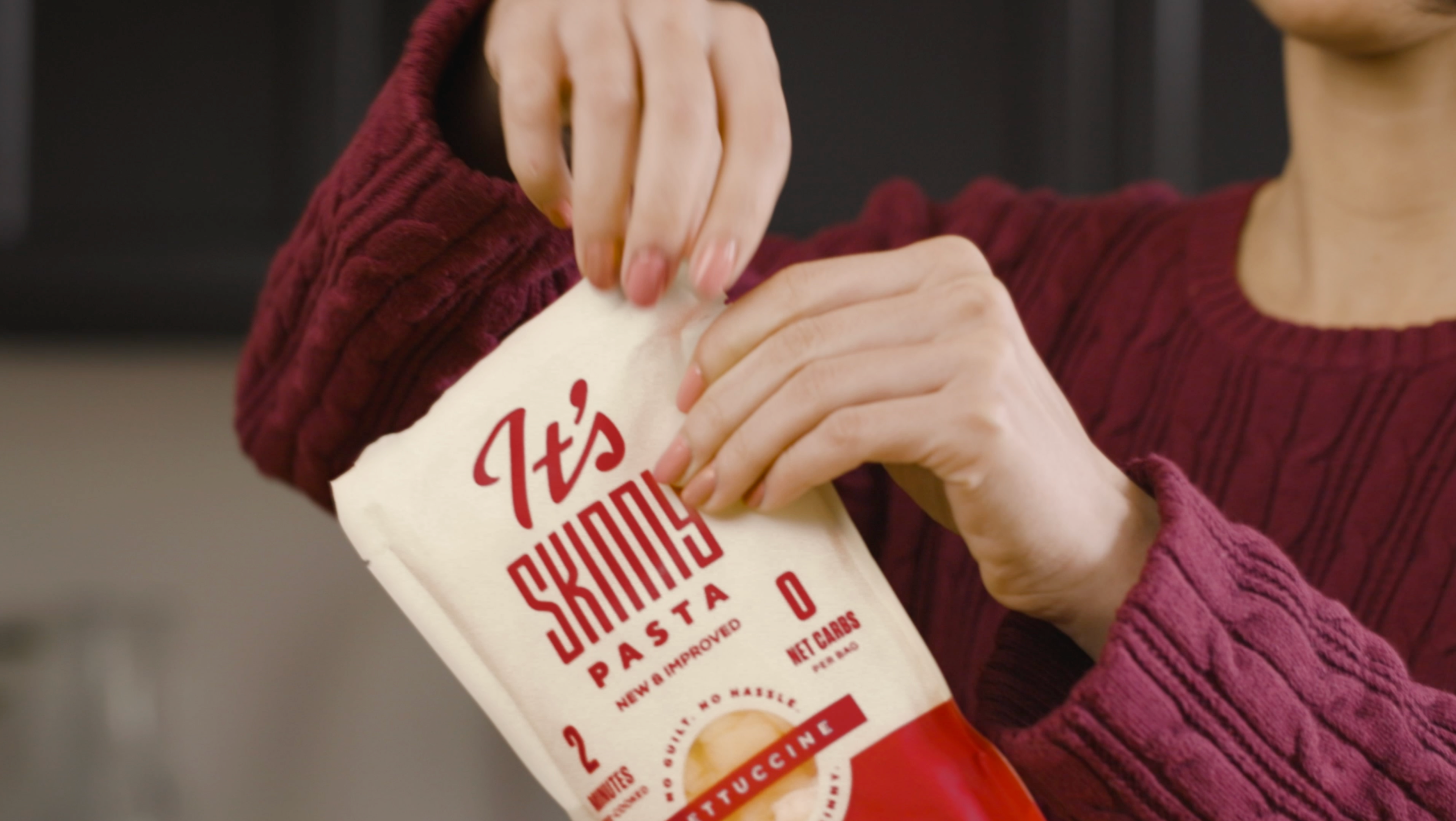
It's Skinny
We helped an alternative pasta navigate a rebrand, packaging redesign, new product line launch and new brand campaign.
CDK
We helped the leading automotive retail software provider rewrite the rules of B2B advertising with breakthrough integrated campaigns.
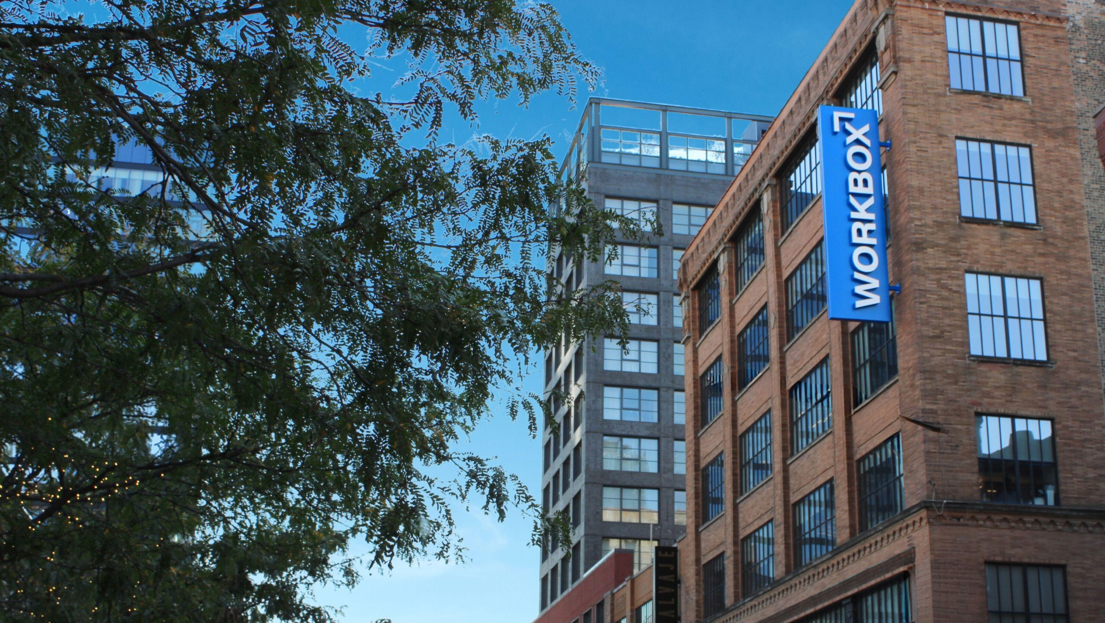
Workbox
We helped a fast-growing coworking space refresh its brand and tell its story with targeted digital media campaigns.
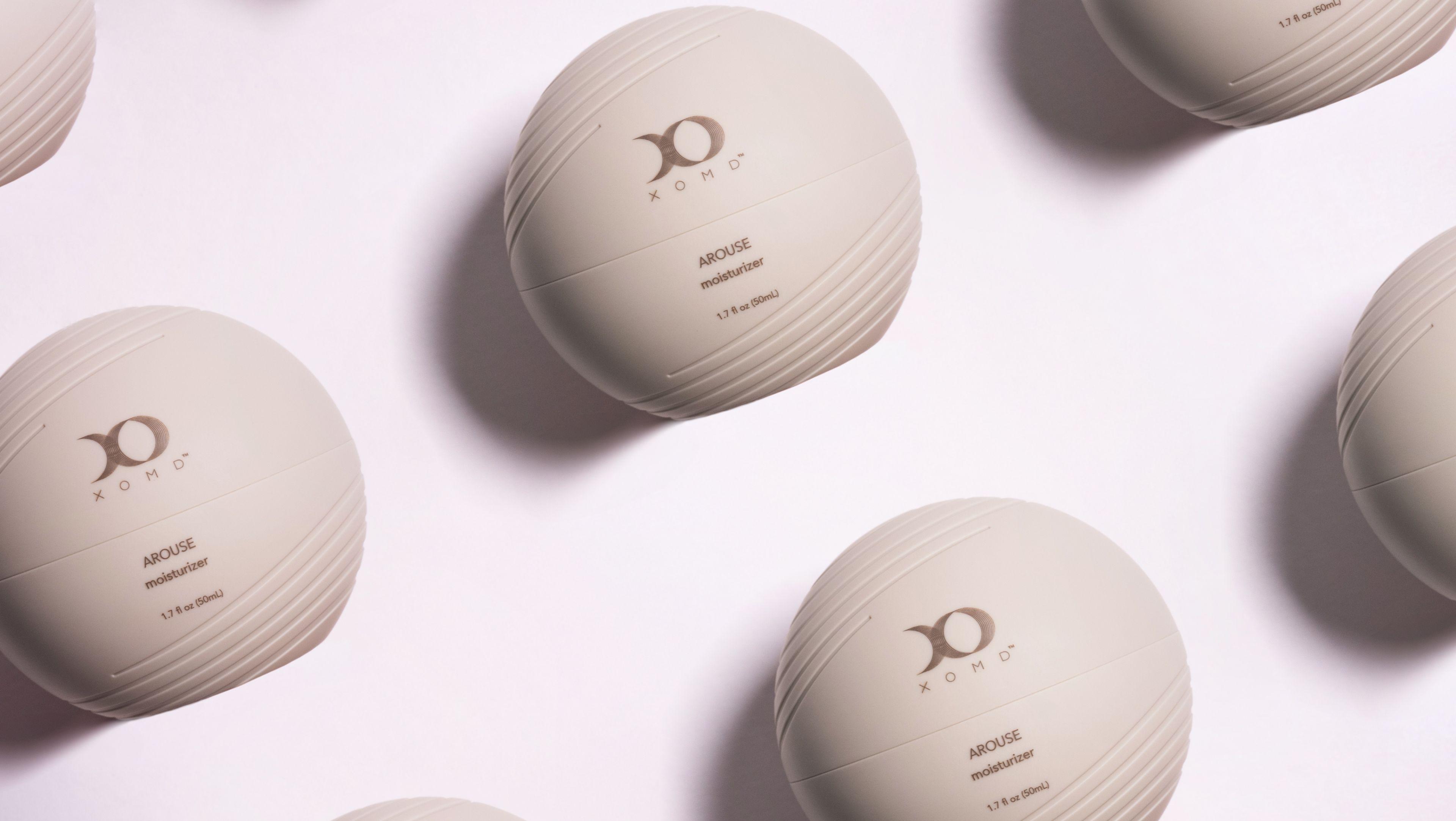
XOMD
We helped two brilliant doctors launch a line of trailblazing skincare and wellness products, complete with custom packaging design.
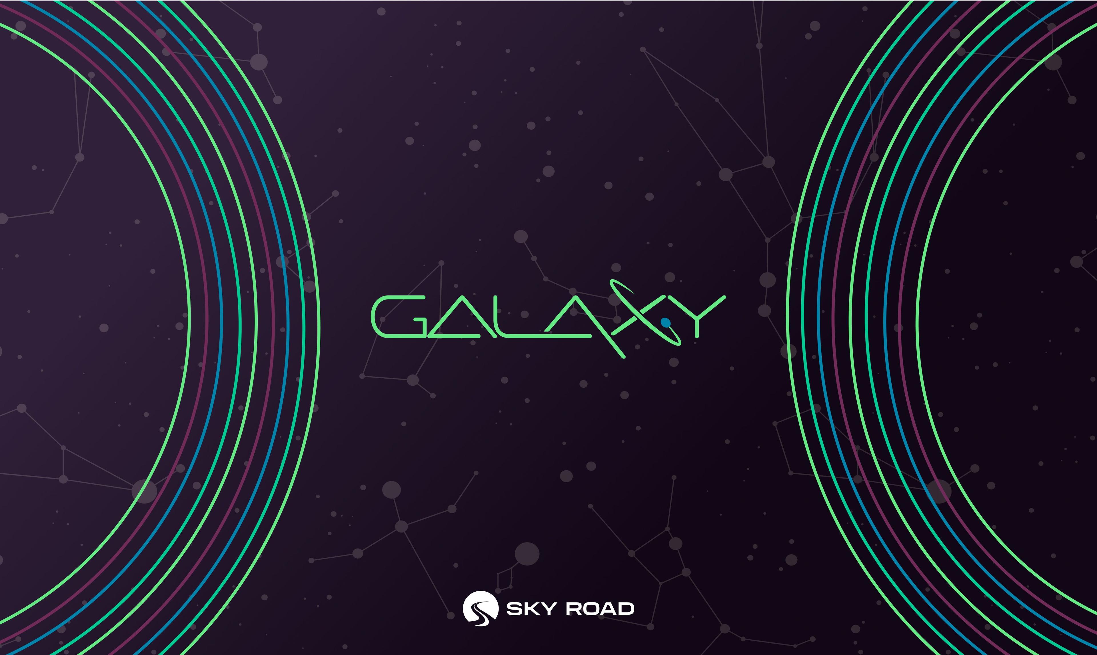
Sky Road
We helped a leading asset management software provider chart a new course with a stellar rebrand.
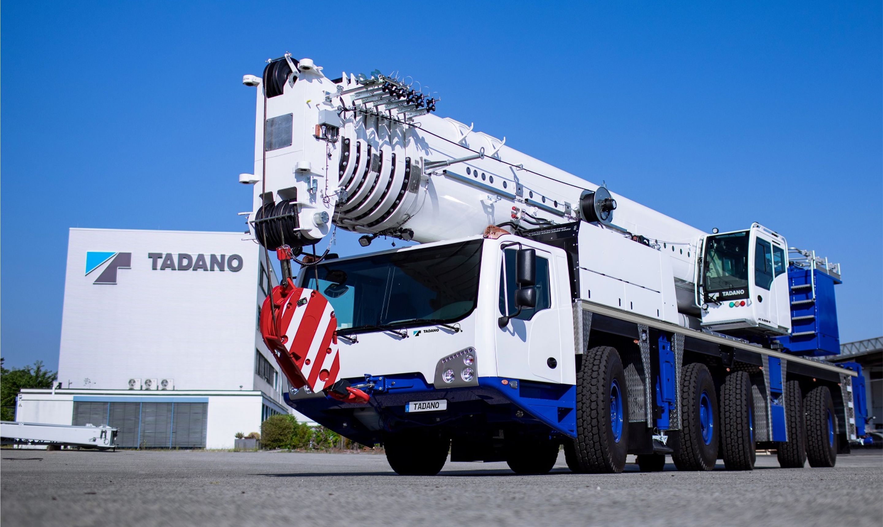
Tadano
We built a unified global web platform and shared digital asset library for a leading international heavy equipment manufacturer.
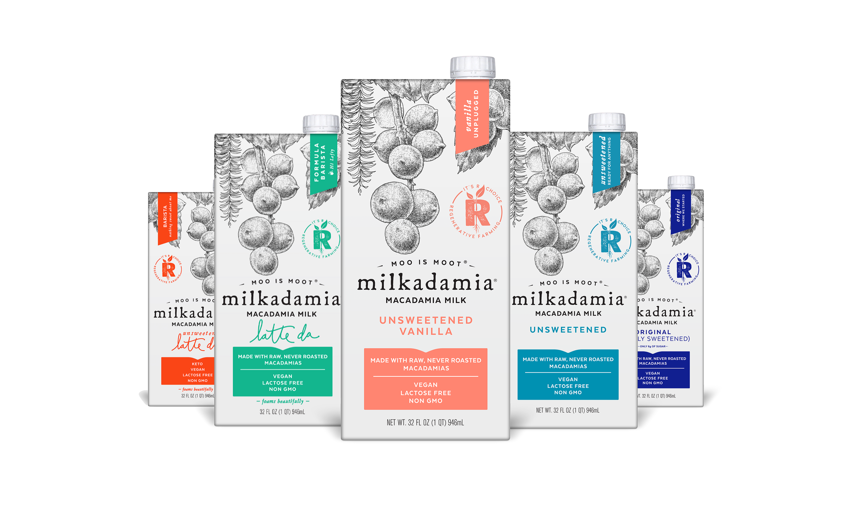
milkadamia
We developed a website, ecommerce store, and fresh, high impact social content for an audacious dairy alternative.